
Watercolor Color Study: Exploring Color Relationships

Color studies are a great way to practice your color mixing skills, and explore new combinations! The end result is a helpful reference guide that just happens to be lovely to display as well.
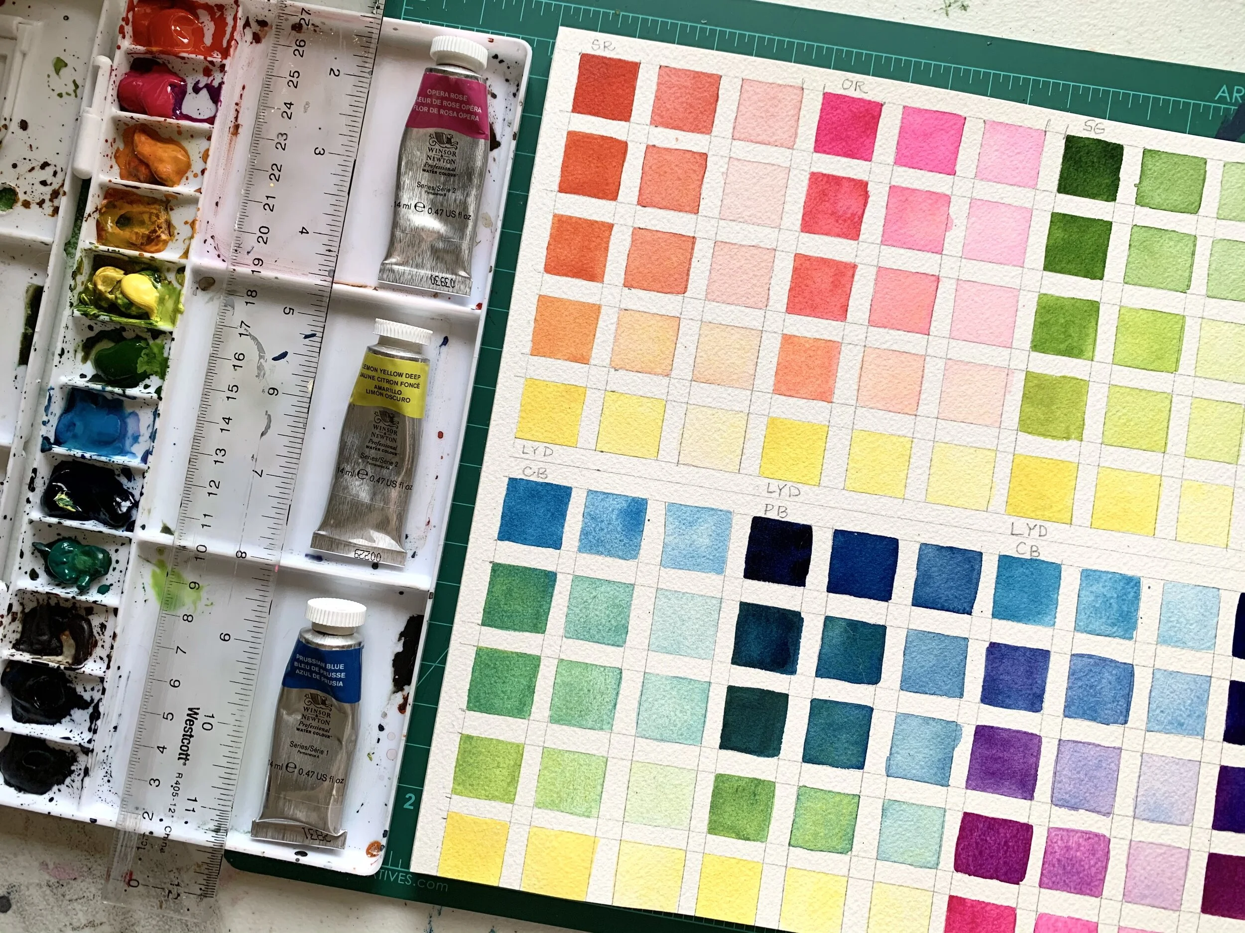
So what is a color study and why bother? Color studies allow you to look in depth at the relationships of colors, and further broaden your knowledge around color mixing. For the majority of today’s study, I explored what it looks like to mix Lemon Yellow Deep with a range of colors in my palette. I also used it to practice creating different values within each color, starting with a rich, pigmented value and adding water gradually to create lighter variations. Since I don’t use white to lighten my watercolor pigments, this exercise helps with determining the right amount of water needed to lighten a color.
To start, you will want to gather your supplies. We will be using:
Watercolor Paper: Whatever your favorite go-to is will work. I’m using Arches Cold Press in a 10 x 14 inch size pad.
Watercolor Paints: I’ll be using watercolor paints from a tube that I have squeezed into my own palette. I prefer tube paints because the pigment is so much richer and more vibrant. You can use any colors you like, but for my example I’ll be using Lemon Yellow Deep, Opera Rose, Scarlet Red, Permanent Sap Green, Viridian, Cerulean Blue, and Prussian Blue. My go-to brand is Winsor and Netwon Professional Watercolours. If you’re new to watercolor tubes, don’t be alarmed by their tiny size! A little goes a long way.
A paint brush: Any watercolor brush you have will work, but I recommend a stroke brush if you would like crisp edges. I’ll be using my Princeton Heritage ½ inch Stroke Brush. The only note I have here is to use a medium to small size brush.
A pencil
A ruler
Now, it’s time to create a grid on your paper with the pencil and ruler. Each study is 3 boxes wide, by 5 boxes tall. My boxes are ¾ inches in size with a ¼ inch space between each box.

Next, you will want to decide what color you want to study. For my example, I wanted to see what Lemon Yellow Deep looked like when mixed with various colors in my palette, particularly two shades of red/pink, green, and blues so that I could explore the subtleties between each. I’m starting with Scarlet Red and Lemon Yellow Deep.

1. The first box (upper left) will be my Scarlet Red. For this, I’m wanting a richly pigmented color. So that means you’ll want enough water to have a fluid application of the paint, but still a bright, rich color.
2. Next, I’ll dip my paint brush in my clean water cup and give it a small swoosh. Tap off any excess water, then paint the box directly to the right of the first one. This should be a slightly lighter swatch of Scarlet Red.
3. Dip your brush back in the water cup, give it another swoosh, and tap off any excess water. Apply the color to the third box in that row. This is your lightest value swatch of Scarlet Red.
For the second row, right below the one you just painted, we are going to explore what it looks like to add a small amount of Lemon Yellow Deep to your Scarlet Red. Pick up a generous amount of Scarlet Red paint from your palette again, like you did to create your very first swatch. Now, pick up a small amount of Lemon Yellow Deep on your brush. Apply this new color to the first box in your second row. This should look like a richly pigmented red-orange color. Repeat steps 2 – 3 to create your value study of this new color.
For the third row, you’ll pick up even more Lemon Yellow Deep to create a bright orange, and repeat the steps to create your value study. For the fourth row, you’ll use even more Lemon Yellow Deep to create a yellow-orange color.
The final row will be pure Lemon Yellow Deep. Ensuring your brush is clean of any red pigment, repeat the steps using pure Lemon Yellow Deep.

Your first color study is complete! You can repeat this process as many times as you’d like, exploring as many color combinations as you desire! Because yellow is used in color mixing so often, I find it is a great color to create a study guide around. The final two studies on my sheet explore Opera Rose mixed with Cerulean Blue and Prussian Blue, to look at the various shades of violet that can be created (see photo below). I find this to be an excellent exercise to work on utilizing the proper amount of water when mixing as well, since that is such a key element of painting with watercolors.

I also recommend labeling your guide to keep track of what colors you have mixed. I just use initials at the top and bottom to note which two colors I started with (ie. “SR” for Scarlet Red and “LYD” for Lemon Yellow Deep).
Want more watercolor tips and tutorials? Check out these posts:
Watercolor Color Theory: How to Create a Full Palette Using Just 3 Paint Colors
Everything You Need to Start Your Watercolor Painting Journey
Want to learn more? Join our Beginner’s Watercolor Workshop online with Assembly PDX! We will review color mixing, 4 watercolor painting techniques, and how to paint fruit using basic shapes. And don’t forget to sign up for our newsletter here!
Product links are affiliate links and allow us to earn a small commission at no cost to you on items should you purchase them via our link. We only link to items we use and love!