
Watercolor Color Theory: How to Create a Full Palette Using Just 3 Paint Colors
When it comes to watercolor supplies, I always recommend purchasing the best quality materials your budget can accommodate, but let’s be real --- art supplies can add up quick! That’s why I want to show you how you can create a wide variety of colors using just three paints. Bonus – you’ll get a crash course on color theory and how colors work together!
Supplies you will need for today’s tutorial:
Red, blue, and yellow watercolor tube paints. My favorites are the Winsor & Newton Professional tube paints, and I’ll be using Scarlet Red, Lemon Yellow Deep, and Prussian Blue. Your color mixing will turn out slightly different than mine if you are using other colors, but that is totally okay as long as they are a red, yellow and blue! This Daniel Smith set is a great place to start, too!
A watercolor paintbrush. I’ll be using my ½ inch Stroke brush by Princeton. This has a flat edge, but you can use a round brush as well.
Watercolor paper. I’m using my all-time favorite Arches Cold Press pad that is 10 x 14 inches, but any heavy weight watercolor paper will work just fine!
A mixing tray or palette
A pencil
A ruler (optional)
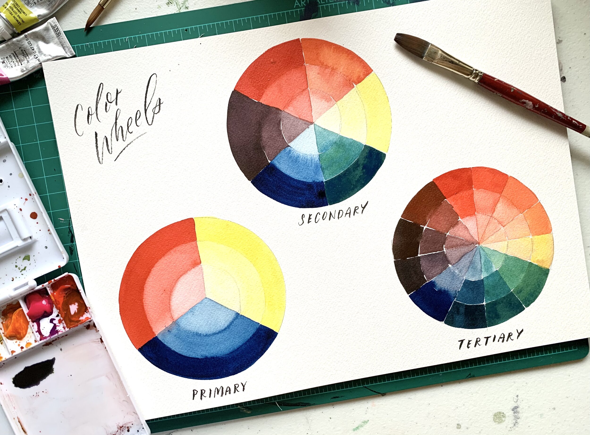
We are going to create color wheels, which will give us an easy visual guide for mixing secondary (orange, green, and violet) and tertiary colors (red-orange, blue-green, etc.). We will also take a look at value (how light or dark the pigment is), as well as learn about complimentary colors. To start, let’s set up our paper.

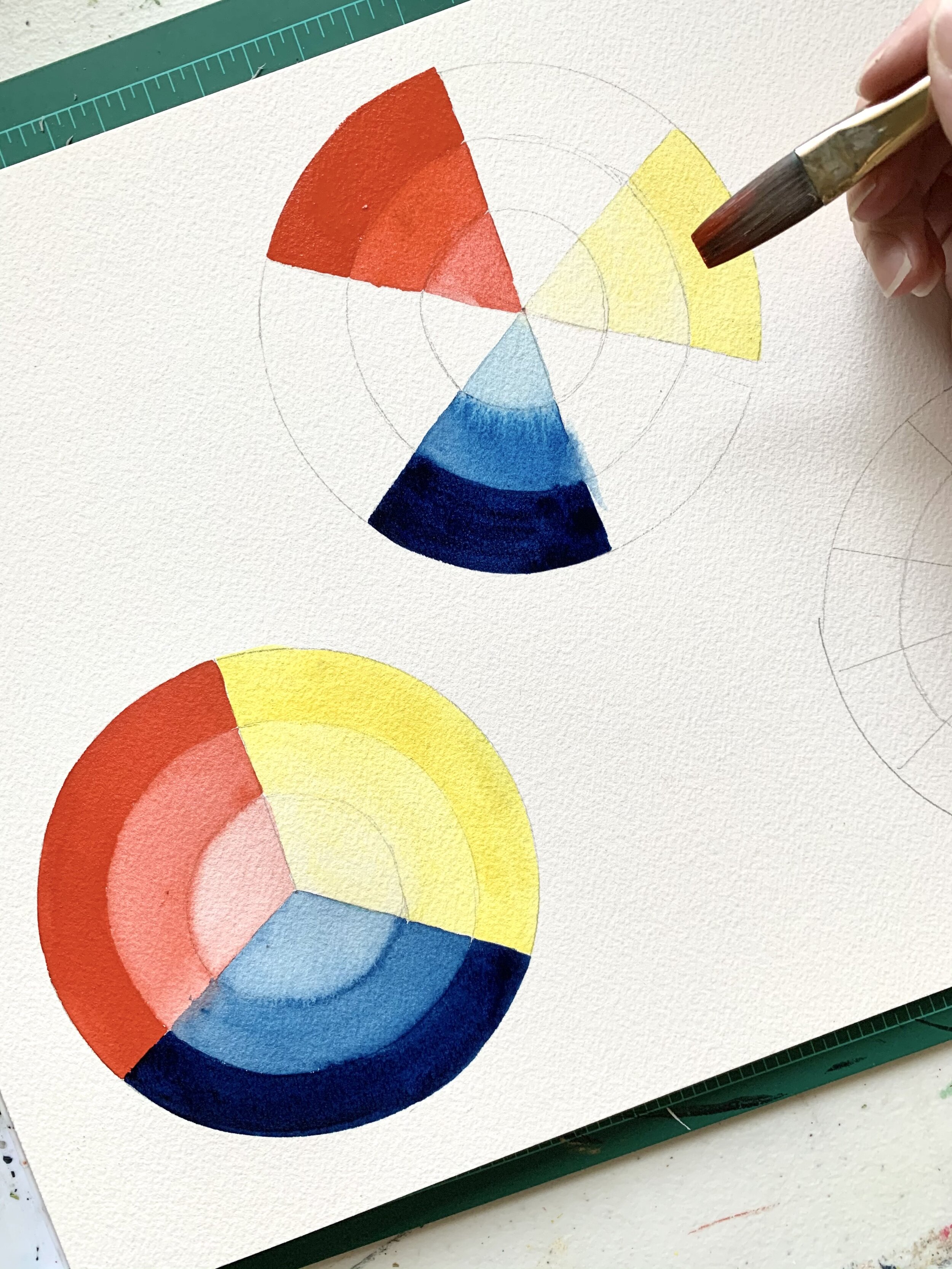
I found a round object that I could use to trace a circle onto my paper. Mine are roughly 4.5” wide, but yours can be any size that is between 3-6 inches depending on the size of your watercolor paper. Draw 3 circles of the same size on your watercolor paper, using your pencil. Find the center of each circle and draw a small dot. Since my cirlces were 4.5 inches wide, the center of mine was 2.25 inches from the edge. Divide your first circle into thirds (like 3 slices of pie!). Divide your second circle into six parts, and lastly, divide your third circle into 12 parts.
The next thing you’ll want to do is create 2 smaller circles inside each of your main circles, like the photo demonstrates. No need to be exact here, these can be freehand and a rough estimate. They will be used for when we study value. Now you’re set up to paint!
Let’s rewind and go all the way back to when we were first introduced to colors as kids, and look at the primary colors – red, blue, and yellow. Primary colors are those which cannot be created by combining any other colors. They are the basis for the rest of our rainbow – by mixing different combinations, we can create oranges, greens, and violets!

Our first circle will be our primary color study. Each segment, or slice, created will be a study of one color, but three values. Here’s how we will paint this color wheel:
Dip your brush in water and pick up a nice, richly saturated amount of red paint. You’ll want this to be easily applied to the paper, and not overly dry. That will be the outermost part of your slice.
Once you have painted that segment, dip your brush in your water and give it a little swish. Wipe off the excess on the edge of your cup, and return to the paper to paint the middle of the red slice. The color should be slightly less saturated than the outermost part.
Dip your brush in the water once again, swishing once or twice, and return to paint the center part of the slice. This should be even lighter than the previous segment.
This is our value study – how light or dark a color is. With watercolor, this variation is achieved by how much water is mixed with your paint. In some mediums, you would perhaps mix white paint to a color to lighten in, but with watercolor, we achieve this through water.
After the red section is dry, repeat for your yellow and blue. The end result will be your primary color wheel, showcasing three different values.
Ready to kick it up a notch? Let’s tackle our secondary colors! Our secondary colors are achieved by mixing our primary colors together to create orange, green, and violet. The first thing we will want to do is paint our primary colors on the second wheel. To do this, start with red, skip a section, paint your yellows, skip a section, and paint your blues. This gives the paint some time to dry before we apply an additional color right next to it, and gives us an excellent visual cue of how color mixing works (see above photo for reference). Let’s break it down:
To create orange, we mix red and yellow. There’s a spot already waiting for the orange, right between red and yellow! We have a visual cue that by mixing those two colors together, we create this new color, orange! Red can easily overpower yellow, so start by taking a small amount of red and adding it to your yellow gradually, until you have a nice, medium orange.
To create green, we mix yellow and blue. Once again, there’s a spot already waiting, right between these two colors. Start by adding a small amount of blue to your yellow to create a medium green. The tone of your color will vary depending on the shade of blue or yellow you are starting with.
Lastly, to create violet, we mix red and blue. My violet is quite dark, as Prussian blue is a deep, richly saturated pigment. Yours may be closer to a grape purple, depending on your paints!

Now we have created our secondary color wheel! This is great time to pause and learn about complimentary colors. Complimentary colors are those that sit across from each other on the color wheel, like red and green. When paired next to each other, these colors make each other pop! That’s why you will see them paired together so often --- Christmas? Red and green galore! The other complimentary colors include orange and blue, as well as violet and yellow. The trick is knowing what these are up front, because while they may sparkle and shine when paired together, when these two colors are mixed they create muddy, brown or black colors. This is good knowledge to keep in your back pocket.
Now we have come to our tertiary color wheel! Tertiary colors are those that are created by mixing our secondary colors with our primary colors. For instance, if we add red to our orange, we get a red-orange. Or, if we add blue to our green, we get a blue-green. Your color wheel should be set up as: Red, red-orange, orange, orange-yellow, yellow, yellow-green, green, blue-green, blue, violet-blue, violet, violet-red for a total of 12 colors.

From just 3 tubes of paint, we have already created 12 colors! There are of course even more subtle adjustments you can create within these parameters to create even more colors- how exciting! So splurge on some good quality paints, and create your own variety of colors! They’re often even more beautiful than straight out of the tube or pan colors anyhow. You can keep your color chart nearby as a pretty visual reference for mixing!
Stay tune for next week’s tutorial on color studies, where we will look at creating even more colors and the differences between using different tones, like a cobalt blue versus Prussian blue when mixing.
Looking for more watercolor tips? Check out these blog posts:
Want to learn more? Join our Beginner’s Watercolor Workshop online with Assembly PDX! We will review color mixing, 4 watercolor painting techniques, and how to paint fruit using basic shapes. And don’t forget to sign up for our newsletter here!
Note: Product links are affiliate links and allow us to earn a small commission at no cost to you on items should you purchase them via our link. We only link to items we use and love!